Matplotlib 可视化应用基础
笔记是针对 Python 可视化工具 Matplotlib 基本信息总结,针对的版本是 3.3.1
TL;DR
- 图形是对象,所有对象都是 Artists
- 图形对象是具有层级关系
- 图像优化可以选择具体的对象进行分别优化
- 数据可视化建议,先简单摸索后优化
作为 Python 可视化中的重要工具,matplotlib 有广泛的应用——不仅是一个独立 package,而且常被作为其他可视化依赖工具——例如 pandas 和 seaborn 可视化均有相关依赖。
1. 图形对象
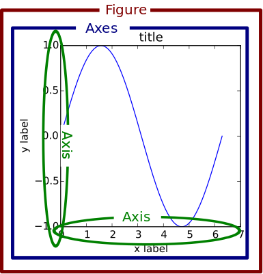
matplotlib 中可视化元素都是对象,理解作为对象的方法以及元素对象在结构上的关系是有必要的。下图说明了表明了图形对象结构:

图摘自:Usage Guide — Matplotlib documentation
上图描述了图形的主要对象包括:
- Title: 图形标题
- Spines: 图形边框
- Axis: 图形坐标轴,包括 X 轴和 Y 轴
- Axis label: 坐标轴标签
- Axis tick: 坐标轴刻度
- Tick label: 坐标轴刻度标签
- Legend: 图形图例,用于说明图形某些信息,例如 circle 大小、颜色等对应数据等关系
- 其他 Artists:这个是一个泛指统称,指在绘图中表达的数据信息以及表达形式,例如散点图中的 circle,线性图中的 line,直方图中的 bar
这些信息也说明了,在进行绘图时需要考虑到有哪些对象可以使用,即可以被用于制图
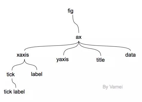
1.1 图形对象层次关系
以上的图说明了图形有哪些对象,应用上需要对图形的对象之间的关系进行一个初步认识:
图摘自:Python Plotting With Matplotlib (Guide) – Real Python
上图说明了图形对象的层次的关系:
Figure:所有的图形对象都包括在该对象中,由其他对象组成构成了一个完整的图。它记录了所有的子对象包括 Axes 以及 “画布”对象 canvas
- Axes:包括了整个图形中主要了图形元素对象,例如 标题、坐标轴、图形信息。它包括了所有的 Artists 对象,是具有数据的图像区域
- Title: 标题
- Axis:坐标轴,用于处理图形中数据范围,它是一个类似线性数据的对象(Number-line-like Objects)。其下有 Locator 对象控制坐标轴刻度位置,Formatter 对象决定坐标轴刻度标签的格式等表现形式
- Locator
- Formatter
- 其他 Artists:具体图形信息,例如图像的文本信息(Text 对象),图像的线性信息(Line2D 对象)饼状图以及其他变形图形信息(Patch 对象)
- Axes:包括了整个图形中主要了图形元素对象,例如 标题、坐标轴、图形信息。它包括了所有的 Artists 对象,是具有数据的图像区域
Artists:所有的 Artist 对象包括了所有在图像中可见的对象(甚至包括 Figure, Axes 和 Axis 对象,包括上面提到的文本信息对象、信息对象等)。所有的 Artists 对象被绘制到“画布”上,当然是在 Figure 对象被渲染时。⚠️注意有些 Artist 对象是被绑定到了 Axes 对象中而不能被共享(例如数据信息对象)
上图部分信息展示了简介对象层次结构,下图更充分展现了完整对象结构:
2. 绘制图形
前文对图形对象和对象层级关系进行了简要概述,下文将从实践的方面来了解 matplotlib 的可视化操作。
2.1 创建 Figure 对象
Figure 对象是整个图形的“根基”,创建的过程中可以使用 figure、subplots 等多种方法得到实例化的 Figure。几种常用的初始化方法示例:
1 | >>> # Load package |
以上两种方法中,直接使用 figure 方法相关参数如下:
matplotlib.pyplot.figure(num=None, figsize=None, dpi=None, facecolor=None,
edgecolor=None, frameon=True, FigureClass=<class ‘matplotlib.figure.Figure’>,
clear=False, **kwargs)
使用 subplots 方法相关参数如下:
matplotlib.pyplot.subplots(nrows=1, ncols=1, sharex=False, sharey=False,
squeeze=True, subplot_kw=None, gridspec_kw=None, **fig_kw)
2.2 使用 Axes 绘图
图形的数据信息对象 Artists,可以通过 Axes 对象实现绘制。Axes 对象可以通过前文中 subplots 方法创建 figure 时得到,也可以通过 gca 方法得到该对象,其底层逻辑为:
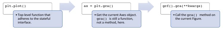
图摘自:Python Plotting With Matplotlib (Guide) – Real Python
2.2.1 绘制基本图形
获取 Axes 对象的常用方式如下:
1 | # 方法一,直接通过 subplots 方法得到 |
通过 Axes 对象绘图的方式,是使用该对象下绘图方法实现;而其他标题、坐标轴等绘制,需要通过响应的 set 方法实现:
1 | # 比较常用的是使用 figsize 调整整个图形大小 |
图形效果如下:

2.2.2 修改标题以及轴标签
完成图形基本绘制之后,继续对标题、坐标轴标签、刻度标签以及条形图的 Bar 调整:
1 | # 设置标题,还可以传入其他字体参数用于调整字体大小颜色等,传入 loc 传入可以控制标题位置 |
图形效果如下:

轴标签的调整涉及到,刻度位置、方向以及文本大小的调整。对于坐标刻度的标签字体等调整,需要使用 axes 对象下的 tick_params 方法,而非 axis 对象下的方法:
Axes.tick_params(axis=’both’, **kwargs)
axis : {'x', 'y', 'both'}, optional
    Which axis to apply the parameters to.

color : color
    Tick color; accepts any mpl color spec.

pad : float
    Distance in points between tick and label.

labelsize : float or str
    Tick label font size in points or as a string (e.g., 'large').

labelcolor : color
    Tick label color; mpl color spec.

colors : color
    Changes the tick color and the label color to the same value: mpl color spec.

bottom, top, left, right : bool
    Whether to draw the respective ticks.

labelbottom, labeltop, labelleft, labelright : bool
    Whether to draw the respective tick labels.

labelrotation : float
    Tick label rotation
使用的示例方法如下:
1 | # 设置了 x 轴的颜色,字体大小和旋转 |
示例效果如下:

2.2.3 修改 patch 颜色
条形图中的 bar 对象可以通过 patches 属性获取,可以通过 patch 属性的 set_color() 方法修改图形颜色:
1 | # 遍历 patch 对象的方式,可以来分别调整每个 bar 的颜色,注意后两个颜色是 16 进制数据 |
图形效果如下:

2.2.4 数据标注
将数据信息表达出来,需要使用 Axes 对象来控制 Text 对象,其中参数如下
Axes.text(x, y, s, fontdict=None, withdash=False, **kwargs)
x, y : scalars
    The position to place the text.
s : str
    The text
使用示例如下:
1 | # 需要使用的数据是 x 和 y 的位置以及数据。 y 的位置和数据 s 可以通过之前的 height 得到,x 坐标位置可以通过 x 数据得到 |
结果如下:

在表达数据信息时,可能遇到不仅仅需要直接表现具体数据,而且需要图例来说明图形信息,因此需要对图形添加 legend。由于之前没有设置 legend 相关信息,需要先从 Axes 对象中得到 legend 信息,它包括了 handles 和 labels 两个对象,之后利用处理完对象之后,使用 legend 方法即可以完成图像图例。
Axes.get_legend_handles_labels(legend_handler_map=None)
Return handles and labels for legend
具体的使用示例如下:
1 | handles, labels = ax.get_legend_handles_labels() |
示例效果如下:

上述是指导绘图的一般方式,而实际应用中方法和调用参数并不完全一致,解决问题的方式是没有完全标准的答案。例如 pandas 中 DataFrame 封装来 plot 方法可以快速绘图,此外还可以直接使用 pyplot 模块中相关方法绘图。
2.3 使用 pyplot 方法绘图
从前文可知 Axes 绘图更精细,但是 plot 绘图的方式更快速,两者在图形调整上都具有相通性——绘图和调整图形都需要控制相应的对象 Axes 需要使用 set 等方式,而 plot 可以直接使用对象名称进行绘图。图形优化和调整的方面还是可以考虑之前的方案,使用 plt.gca() 方法来得到 Axes 对象进行调整。
2.3.1 绘制散点图及其调整示例一
1 | # load package |
结果示例:

2.3.2 绘制散点图以及调整示例二
1 | height_width = 5 |
结果示例:
